Diversity, Equity, and Inclusion (DEI) are becoming increasingly important in today's business world. As the…
How do you prove that you have the best idea or solution?
You say over and over that your solution saves money. But what does that mean to your clients? A dollar a month? A thousand dollars a day? Is it significant enough for them to invest in your solution and change their current corporate process? They want and expect you to prove your claim, so what is the best way to do this?
Step 1: Provide Real-world Data
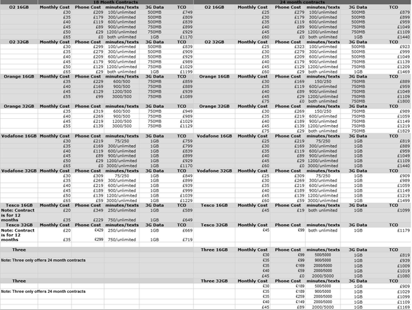
One of the simplest ways to sway your audience is to back up your assertions with real numbers. To show how your solution saves money, you could provide a spreadsheet that compares your solution’s costs to the current solution based on research conducted by a reputable resource. Unfortunately, spreadsheets can be difficult to digest and are far from memorable and compelling. Look at the following example. Is this the fastest way to analyze data?
Because, like you, viewers are often resource starved, rushed, and hate sifting through mountains of data to do their job, it is in our best interest to make data analysis easy. Though a well-researched spreadsheet of your solution is a perfect first step to support your claim, we need to distill this data into something your audience can quickly digest and remember.
Step 2: Turn Data Into a Quantitative Chart
Consolidate data into bite-size chunks that can be analyzed quickly. (You can include your spreadsheets as back up data when applicable.) Quantitative charts—like bar charts, area charts, line charts, and pie charts—make it easy to compare data. Many spreadsheet packages allow you to automatically generate charts from your data, helping you better visualize the comparisons between the solutions. (To see more examples of quantitative charts go to Get My Graphic.) How easy is it to compare the following numbers?
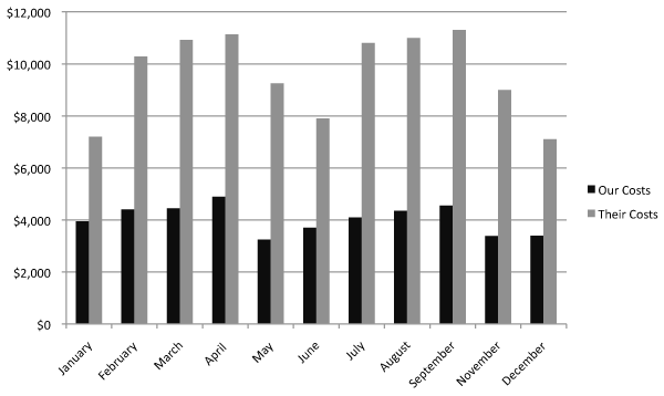
Although much improved over a spreadsheet, a quantitative chart alone is not that memorable. Let’s face it. You’ve seen countless bar charts, area charts, line charts, and pie charts every year. What makes this bar chart stand out from all the others you’ve seen? It looks like a generic chart rendered in Excel. Would you remember this chart a day, a week, a year from now? If you are like most people, probably not.
Step 3: Use Visual Embellishment
The Department of Computer Science, University of Saskatchewan, Saskatoon, Saskatchewan, Canada, conducted an experiment to determine if visual embellishment in information charts was a detractor. (Click here to download the study.)
“Guidelines for designing information charts often state that the presentation should reduce ‘chart junk’ – visual embellishments that are not essential to understanding the data. In contrast, some popular chart designers wrap the presented data in detailed and elaborate imagery, raising the questions of whether this imagery is really as detrimental to understanding as has been proposed, and whether the visual embellishment may have other benefits. To investigate these issues, we conducted an experiment that compared embellished charts with plain ones, and measured both interpretation accuracy and long-term recall. We found that people‘s accuracy in describing the embellished charts was no worse than for plain charts, and that their recall after a two-to-three-week gap was significantly better.”
The following example, published in the study’s findings, shows a chart developed by Nigel Holmes (left), a renowned visual communicator, and a “plain version.” Which drew your attention first? Which is more memorable?
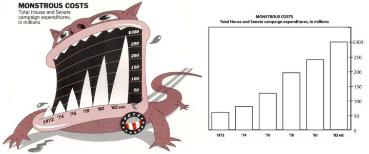
In an interesting twist, Mr. Holmes designed his chart as a personification of the “monstrous” costs. (See if you remember his chart in a few days. I’m betting that you will.) We don’t always have the creative license to transform our data into something as fun as the “monstrous” chart, but we can learn that quantitative charts don’t need to follow the plain chart mold to communicate our data. In fact, thinking outside the standard quantitative chart by using a visual metaphor, simile, analogy, or icon/symbol will grab your audience’s attention and help increase their recollection of your data.
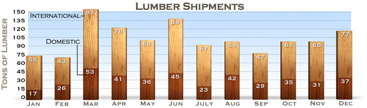
So what kind of embellishment can we use on our chart to make our “saves money” assertion really stand out? We could replace the bars with stacks of money, showing money literally piling up from the savings realized from using our solution. We could add callout text that reads “38% cost savings.” Depending on your solution, you can weave your product (or something associated with your product or solution) into the chart. For example, below is a chart for a lumber company depicting shipments made throughout the year. I used different wood stains to show the difference in international versus domestic shipments.
Most quantitative charts are far from unique and, therefore, fail to stand out. Using a visually embellished quantitative chart helps ensure your data stands out, is remembered and, ultimately, helps you succeed. Challenge yourself to think beyond the standard charts and create something truly memorable.
Related Posts