Diversity, Equity, and Inclusion (DEI) are becoming increasingly important in today's business world. As the…
Most complex procurements do not need complex graphics. Clear, easy-to-follow language improves understanding, recollection and agreement. The same is true for proposal graphics. The KISS—Keep It Simple Silly—rule applies to all forms of communication.
However, there are times when illustrating complexity is part of a winning strategy. For example, you may want to show that the solution is complex and, therefore, requires specific experience or expertise to complete.
A complex solution does not need to be confusing. Confusing graphics lose proposals. Albert Einstein was right when he said, “If you can’t explain it simply, you don’t understand it well enough.” The secret is to summarize your solution with one, concise message (i.e., headline or takeaway).
Because the confused mind says no, a complex graphic must quickly and clearly communicate the main point (the message). It is our job as proposal professionals to help the decision maker(s) understand our solution and choose us.
The following are three methods I use when making a complex, winning graphic:
- Get to the Point
- Chunk It
- Connect the Dots
Get to the Point
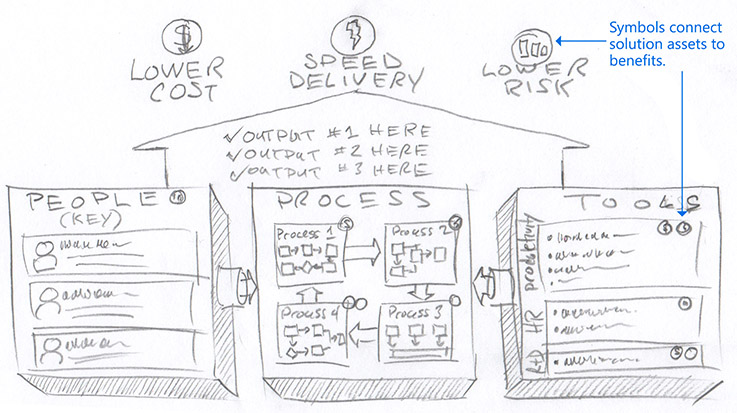
The main point should be obvious. Your main point is a one sentence message. (It is also called an “action caption,” which often appears with your graphic.) For example, if the main message is that your solution saves money, speeds delivery and lowers risk, the graphic should clearly show this. It must be evident to the reviewer. Never bury the main point. Highlight it through aesthetic choices such as size, style, color and positioning.
Chunk It
Chunking breaks complex content into bite size, digestible morsels. Group and label similar elements to avoid confusion. For example, arrange your approach into a timeline. Drawing a box around pre-award activities chunks those activities, clarifies when they occur and makes the content more approachable.
Connect the Dots
Prove that you can deliver as promised by connecting the solution assets to the promised outcomes. For example, use icons to flag those tools, people, or processes (solution assets) that are most responsible for delivering the results (e.g., saving money, speedy delivery and/or lowering risk).
The following sketch is an example that uses my three methods.
Clear, compelling communication is a critical success factor. The three methods—Get to the Point, Chunk It, and Connect the Dots—work together to improve communication quality and, your win rate.
Related Posts