Diversity, Equity, and Inclusion (DEI) are becoming increasingly important in today's business world. As the…
By Colleen Jolly, PPF.APMP
Have you ever felt compelled to do something? Like spending more time or money than you intended? Do you want to learn how to influence your customer’s buying decisions in formal and informal proposals and presentations using the tools employed by world-class casinos? Of course you do! Casinos employ scientifically proven psychological devices in their physical layout, method of game play, and even the smell of their casinos. Using these strategies to improve the structure and visual appearance of your bids will increase the chances that your customers will choose your solution.
Why Casinos?
The concept of casinos and casino gambling as an institution is an internationally familiar one with some type of casino or place for formalized gambling being present on 6 of the 7 continents and in more than 150 countries, according to CasinoCity.com. Casinos, for better or worse, have a reputation of encouraging people to spend more time and money than they intended, which is something as bid professionals we need to learn to harness in how we deliver information and ultimately sell to our customers.
5 Main Components
There are 5 main components of casinos that can be applied directly to bids and proposals, whether they are done in a written document, an in-person demo, or even through sending unsolicited multimedia-marketing materials to a potential client.
| Casino | Bid/Proposals |
|---|---|
| 1.Environment and Ambience | 1.Page (Slide, Web, Document) Layout |
| 2.Color (slots, carpets, etc.) | 2.Color (of everything!) |
| 3.Lights, Sound, and Activity | 3.Emotional Imagery and Animations |
| 4.Location of Services | 4.Roadmaps, CONOPs, and Icons |
| 5.Freebies! | 5.Freebies! |
Environment and Ambience/Page Layout
Casinos want you to focus on what you are doing and not worry about the outside world. To that end, most casinos have no or few windows, no or few clocks, and notoriously bad mobile phone reception. They are literally helping you lose track of time and ignore everything but the task at hand, namely spending your money. Casinos also control the temperature, the air quality, and the smells inside their facilities. Some unsubstantiated claims say that casinos pump in pure oxygen and even pheromones into the air systems that encourage aggressive gambling behavior. What is known, is that Harrah’s Casino in Las Vegas saw a 45% increase in revenue from slot machines near where a pleasant smell was sprayed compared to machines that did not have a scent applied. Dr. Alan Hirsch, the founder and director of the Smell and Taste Research Center near Chicago, Illinois, claims that “pleasant” smells are often a mix of scents designed to improve but not distract from the slot machine experience.
In your bids, your environment and ambience is your packaging and page layout, the page being a structure for delivering information that can be printed, presented, or even appear on the web. Pages are not merely decoration, they are communication.
A 1992 study on documentation conducted by Karen Schriver found that the majority of Americans expected clarity in the information they received and that 63% of those people would pay more than 4 times the industry price to guarantee they were receiving a product or service with clear documentation.
Another researcher, Jakob Nielsen, focusing on the online-experience in 2006, discovered that web readers do not read, they scan web pages with the scan creating an F-shaped pattern from left to right (for those readers whose languages are read from left to right—presumably those that read right to left would have a similar and opposite scan-pattern) starting at the top with only about 10 seconds spent per page view. Newspaper readers read in a similar way (for left to right languages) starting at the top left and moving in a zig-zag pattern down the page scanning for items of interest such as photographs, shapes, or colors that are not in the standard layout which may interrupt the pattern.
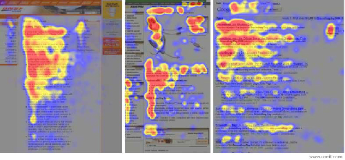
Figure. F-shaped heat scan of web page reviewers show the most important elements viewed are in the top left
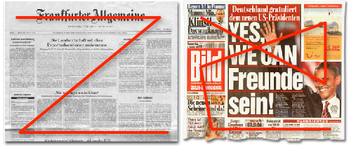
Figure. Print readers scan information in a Z-shaped pattern also starting in the upper left. Color, imagery or other unusual or disrupting visual elements interrupt that shape and draw the viewers eyes
For bid professionals this tells us that we must put the most important information in the top left, particularly for English language bids, and learn how to use design tools to break up the pattern of scanning.
We must employ 6 core concepts for effective page layout:
- Contrast: big and small elements, black and white text, squares and circles, and other opposite pairings all create contrast in design
- Proximity: physical/visual closeness creates a bond between people and between elements on a page
- White space: gives your design breathing room and a ‘break’ for your audience
- Consistency: Repeating design elements and consistent use of type and graphics styles helps your reader or audience navigate your designs and layouts the way they expect
- Balance: arranging elements on the page so that no one section is heavier than the other or arranging the elements so they are dynamic but not imbalanced
- Alignment: relationships of parts of your layout (text, headers, graphics, tables, etc.) to each other can make your layout easier or more difficult to read or encourage a positive emotional response
Color/Color
Casinos further control the environment and ambience of a place by controlling the colors not just of the walls or decorations but also the carpeting and even the slot machines. Many casinos, especially the famous ones on the Vegas ‘Strip’ have particular themes they consistently apply such as the colors of a New York evening in the hotel “New York, New York” or the dusty, ancient feel of the pyramids with matching obelisk and hieroglyphics in the Egyptian-themed “Luxor.”
Yahoo online contributor L. Vincent Poupard, who studies and writes about the entertainment industry, posits that casinos use familiar references to cultural color when creating their slot machines:
“If you look closely at most slot machines, you will find that their designs predominantly push the colors of red, yellow, and green. These are the same three colors as a stoplight. This is not a coincidence, but a strong display of slot machine design psychology. We are trained that red means to stop. So we will stop and look at the slot machine. Our brains realize that yellow is a color that is supposed to put us on alert. So we look closer at the game. Green is a symbol for proceeding (towards the game). Remember, slot machine design psychology also teaches that green is the color of money. Also, don’t forget about that big red light on the top of the machine that spins when there is a big winner.”
Some slot machines even use familiar television and movie characters to entice us to approach including the newly popular game “Angry Birds” and some older favorites such as American TV icon Dick Clark.
We know from design and art studies that color is the first and most important aspect of anything that is seen. It is the first visual characteristic that we react to and immediately elicits an emotional reaction that may change depending on our preconceptions and our cultural influences.
Kissmetrics, a web-base analytics company, compiled several color psychology studies to come up with a comprehensive and easy to use reference infographic for how color affects consumers. They found that consumers overwhelmingly used the visual appearance of a product when deciding which product to buy (93%) with more than 85% of shoppers claiming that the color as part of the physical appearance is a primary reason why they bought a particular product. Color also increased brand recognition by more than 80%, which is linked directly to consumer confidence and repeat purchasing.
In bids, unless we are extremely limited in using color, we must use color purposefully and consistently to highlight what we are selling. Color meanings and associations can change dramatically between countries and cultures so before you choose a color or attempt to institute one common template or marketing style for a global network, run tests with local clients and confirm you are selling and saying what you intend.
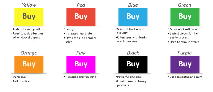
Figure. Use these color understanding and visual impacts as understood by the US consumer on your next bid to subconsciously influence buying decisions.
Consistency in its simplest form means creating a template that will be used throughout at least this one bid and making sure it is applied to every graphics and not just a few because you were too busy or the files came in too late to update. Your audience or reviewer will see those differences immediately and will not view you as highly or consider you as professional as the company that did take the extra time to confirm everything was in a common template before submission.
Lights, Sounds, and Activity/Emotional Imagery and Animations
Casinos control every aspect of your experience including the sounds you hear. Casinos are frantic places with flashing lights, loud noises, and the constant motion of people, staff, and machines that all compete with the overall calming nature of smells and colors that are also competing for your attention. Sound confusing? It is and so your brain sorts through all that to find the pieces that it understands. Over and above the cacophony you hear the sound of winning—coins plunking, buzzers buzzing (often with an accompanying light on top going off), and the bloop-bloop of electronic gaming. And that continued sound of winning makes you feel like you must have a chance at winning since the sounds are so loud it appears that many people are also winning. Your emotional state has quickly, almost instantaneously, adjusted to the frenetic pace and is purring right in the center between very, very excited and very, very calm.
Your proposals are similar. You have a lot of information (in many cases asked for specifically by your potential customer) and potentially a lot of discriminators and key messages that you must quickly and successful get out. You want your customer to be excited to work with you but not so excited that they cannot justify a purchase to their superior or rest of their team. They must be kept calm but at the same time engaged and excited with the idea of working with you and receiving the benefits you claim from your product or service.
You may have precious little time to engage and excite your customer before you can back up your claims. The Kissmetrics infographic mentioned previously also indicated that 42% of shoppers base their initial opinion of a website on the overall design aesthetic alone, and 52% of shoppers did not return to a website because of the aesthetic. What this means is that if a person does not immediately see a value in your materials from a pure aesthetic sense then they will not become engaged and they will not read more. So, spend time on your covers, packaging, and executive summaries.
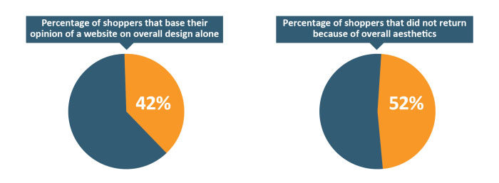
Figure. People do judge a book by its cover and perceive value directly from visual cues that trigger emotional reactions. Do not let your proposal be judged unfairly.
Use animations and other multimedia or interactive elements such as embedded videos, Flash, or sounds with caution. Animations, like color, should always be used purposefully with the intent to explain complex ideas in a simple, building-block way as opposed to doing something simply because it seems “cool.” Use the animations built into PowerPoint and as much as possible test the computer, the projector, and other variables before getting in front of a client—you do not want to lose a bid or look unprofessional because your animation failed at a critical juncture.
The best animations functions in PowerPoint are appear, disappear, and fade. Animations that whirl and blink, while tempting to use to spice up a presentation, can distract and unintentionally communicate that you are unprofessional. Think through your script or “talk track” on how you deliver information. If you find yourself saying “first we do this and then this,” that is a great sign to create a build animation and have pieces appear as you talk about them. This can help your reviewer focus on key elements one at a time.
Location of Services/Roadmaps, CONOPs and Icons
Control is the word most commonly associated with casinos and that extends to the location of services within the casino complex. Gaming floors are often a maze—all structural elements are not short enough to see over to achieve a holistic view of the area with all services you need (restrooms, areas to cash out your chips, etc.) at opposite ends of the floor, encouraging you to meander, potentially stopping and playing on the long trek around. The casinos are betting that you will enjoy getting lost and perhaps spend more money than you intended as you make your way around.
In bids we do not want to confuse or befuddle our reviewers but we do want them to take specific paths that we control and intend through our material. We want to show them an overview of our solution in a straightforward and easy way that encourages them to read more. Even if your solution is complex, no one wants to buy a difficult solution so make it easier to understand by addressing the solution from a macro or bird’s eye view and then breaking down component parts to address the finer points of your solution when it is relevant to do so. Putting a ton of information on one slide or graphic can confuse your reviewer and, much like the PowerPoint build concept described in the animations section, think through what pieces overall you need to discuss first—what are the key elements that your potential new customer cares about and address those. Resist the urge to explain the tiny details in the Executive Summary.
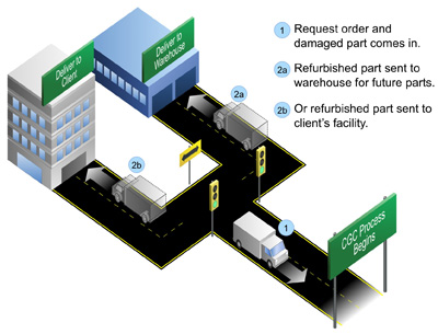
IA concept of operations (CONOPs) graphic functions in the same way as a roadmap graphic but may also include or depict the specific desired objectives or end state complete with direct benefits and not simply the components of the solution. This term is more common in Federal or Military proposals but functions the same way— make your solution straightforward and easy to understand for your busy reviewers, and then break out component parts to showing detail when relevant to do so.
Icons are typically significantly smaller graphics and focus on one key visual metaphor that functions as a stand in for a more complex concept. Icons function best when they correspond with key discriminators that address your customer’s hot buttons such as innovation or low cost. Pick an image that is identifiable at a small size (1 inch x 1 inch) and is logically relevant or familiar to your audience (such as using a light bulb for innovation or a dollar sign when discussing cost in the US). Define your icons early in your proposal so your reviewer understands the purpose and then use that same image throughout your text and your graphics to quickly help them identify aspects of your solution that correspond to those hot buttons. Addressing the concept can be as simple as using this sentence: “We have identified the following three beneficial core elements of our solution: . These icons correspond to the elements of our solution where you benefit in that direct way.”
Think of icons as a set of relevant breadcrumbs to provide a different kind of roadmap through your materials than the macro or CONOPs described above. Icons and CONOPs can absolutely be used together to further control and explain your solution in a direct and understandable way.
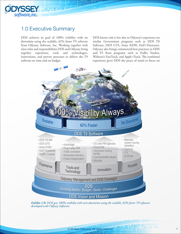
Figure. CONOPs graphics show the overall solution and then several relevant breakouts to describe your complex solution in a bite-sized and easy to understand way.
Freebies!
Freebies or “comps” are the lifeblood of the casino. Sitting at or near a slot machine or gaming table guarantees a free beverage. Free entertainment, passes to shows, free food or rooms are all items that casinos give away to encourage people to come back to their casino, and not another. Casinos make the money spent or “lost” on freebies back a hundred fold from that customer loyalty and repeat business or increased playing.
IFreebies in business can come in many different types but are absolutely not bribes—they are things that can assist your client in deciding to buy your services such as free demonstrations of software, free trial periods or audits, white papers or relevant case studies that depict situations similar to yours, and even marketing materials that site facts or independent verification of the importance of the service or product. Providing a money back guarantee or a buy back plan is also a freebie that can provide great benefit to your client—even if they never use it they see you as a more trustworthy company or a “good bet.”
Casinos treat every customer to a minimum level of free service but they treat their high-rollers or repeat customers that spend large quantities of money to even more benefits. What are you doing to keep your “high-rollers?” Do you know why your customers keep coming back to your company and not your competitor? If you do not, try conducting a satisfaction survey to understand what value you truly provide. It is easier to grow and keep existing customers than to find new ones—do your customers know all the products or services you provide? What type of additional things could you sell them? Develop personal relationships with your customers through regular meetings, phone calls, or lunches and then keep them involved digitally. Create a newsletter of useful information emailed to them regularly or use social media marketing to inform them of new trends through Twitter, LinkedIn, Facebook, or other relevant method. Not all social media works for every person or every business. Be as involved as is comfortable and always provide value no matter how you choose to communicate.
Try it on your next Bid
The psychology of buying, as known in the Western world with regards to color, style, page/slide architecture, and dominant buying methodologies, is consistent amongst most English speaking countries such as the US, Canada, the UK, South Africa, and Australia as well as many Western European countries. Casinos are also a familiar concept and a highly lucrative endeavor on any continent. As bid professionals we need to harness how casinos keep their customers engaged and spending money time and time again.
Try using some of these tips on your next bid or proposal and do not get overwhelmed! Focus on one key aspect at time such as working on your overall color or identifying what freebies you could provide your customer before, during, or after the formal proposal process.
Small steps will improve your materials and capture more business.
Focus on your customer’s needs and wants and you will hit the jackpot every time!
Colleen Jolly, PPF.APMP, a 13+ year proposal veteran, manages a global professional proposal graphic company – 24 Hour Company with offices in the US and UK. Colleen is very active in the APMP and serves as the current COO of the international board, former Layout Editor for the APMP Journal and former Secretary of the NCA Chapter. She was named an APMP Fellow in 2010. She is a frequent worldwide speaker and writer on creative and general business topics, and has spoken at most APMP conferences around the world.
She holds a BA from Georgetown University, and is active in leadership roles and Board positions in arts and women’s non-profit organizations. Colleen is an award-winning artist and business professional—most recently she won the APMP Insight Award in 2012 for her article on international business, was featured in Northern Virginia magazine’s ‘Top 10 Entrepreneurs Under 30’ in 2010 and was a finalist for the Stevie Awards Creative Professional of the Year, 2009. Her company won entry into Inc. 5,000’s Fast Growing Companies three times: in 2007, 2011 and 2012. She has been published six times in a women’s entrepreneurial calendar.


