Diversity, Equity, and Inclusion (DEI) are becoming increasingly important in today's business world. As the…
Michelle A. Borkin, Student Member, IEEE, Azalea A. Vo, Zoya Bylinskii, Phillip Isola, Student Member, IEEE, Shashank Sunkavalli, Aude Oliva, and Hanspeter Pfister, Senior Member, IEEE
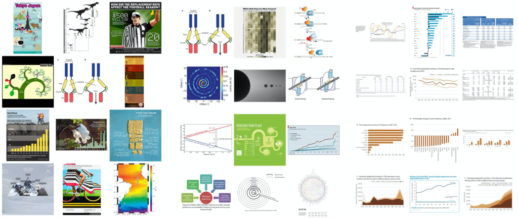 Fig. 1. Left: The top twelve overall most memorable visualizations from our experiment (most to least memorable from top left to bottom right). Middle: The top twelve most memorable visualizations from our experiment when visualizations containing human recognizable cartoons or images are removed (most to least memorable from top left to bottom right). Right: The twelve least memorable visualizations from our experiment (most to least memorable from top left to bottom right).
Abstract—An ongoing debate in the Visualization community concerns the role that visualization types play in data understanding. In human cognition, understanding and memorability are intertwined. As a first step towards being able to ask questions about impact and effectiveness, here we ask: “What makes a visualization memorable?” We ran the largest scale visualization study to date using 2,070 single-panel visualizations, categorized with visualization type (e.g., bar chart, line graph, etc.), collected from news media sites, government reports, scientific journals, and infographic sources. Each visualization was annotated with additional attributes, including ratings for data-ink ratios and visual densities. Using Amazon’s Mechanical Turk, we collected memorability scores for hundreds of these visualizations, and discovered that observers are consistent in which visualizations they find memorable and forgettable. We find intuitive results (e.g., attributes like color and the inclusion of a human recognizable object enhance memorability) and less intuitive results (e.g., common graphs are less memorable than unique visualization types). Altogether our findings suggest that quantifying memorability is a general metric of the utility of information, an essential step towards determining how to design effective visualizations.
Index Terms—Visualization taxonomy, information visualization, memorability
1 INTRODUCTION
The Visualization community has recently witnessed a divide over the value and impact of excessive chart annotation and decoration (i.e., “chart junk”). The conventional view, promoted by visualization experts such as Edward Tufte and Stephen Few, holds that visualizations
- Michelle A. Borkin is with the School of Engineering & Applied Sciences, Harvard University. E-mail: borkin@seas.harvard.edu.
- Azalea A. Vo is with the School of Engineering & Applied Sciences, Harvard University. E-mail: azalea@post.harvard.edu.
- Zoya Bylinkii is with the Computer Science and Artificial Intelligence Laboratory at the Massachusetts Institute of Technology. E-mail: zoya@mit.edu.
- Phillip Isola is with the Department of Brain and Cognitive Sciences at the Massachusetts Institute of Technology. E-mail: phillipi@mit.edu.
- Shashank Sunkavalli is with the School of Engineering & Applied Sciences, Harvard University. E-mail: sunkavalli@post.harvard.edu.
- Aude Oliva is with the Computer Science and Artificial Intelligence Laboratory at the Massachusetts Institute of Technology. E-mail: oliva@mit.edu.
- Hanspeter Pfister is with the School of Engineering & Applied Sciences, Harvard University. E-mail: pfister@seas.harvard.edu.
Manuscript received 31 March 2013; accepted 1 August 2013; posted online 13 October 2013; mailed on 4 October 2013. For information on obtaining reprints of this article, please send e-mail to: tvcg@computer.org.
should not include chart junk and should show the data as clearly as possible without any distractors [13, 14, 37, 38]. This view has also been supported by psychology lab studies, which show that simple and clear visualizations are easier to understand [11, 24]. At the other end of the spectrum, researchers have published that chart junk can possibly improve retention and force a viewer to expend more cognitive effort to understand the graph, thus increasing their knowledge and understanding of the data [4, 8, 19]. However, the findings of these studies have been widely debated [13, 14].
What researchers agree on is that chart junk is not the only factor that influences how a person sees, interprets, and remembers a visualization. Other aspects of the visualization, such as graph type, color, or aesthetics, also influence a visualization’s cognitive workload and retention [8, 19, 39]. To disentangle these confounding factors we set out to answer the basic question: “What makes a visualization memorable?” Clearly, a more memorable visualization is not necessarily a more comprehensible one. However, knowing what makes a visualization memorable is a step towards answering higher level questions like “What makes a visualization engaging?” or “What makes a visualization effective?”. Recent work has shown that memorability of images of natural scenes is consistent across people, suggesting that some images are intrinsically more memorable than others, independent of an individual’s contexts and biases [20]. We are interested in understanding if these findings hold for visualizations, and what key factors make some visualizations intrinsically more memorable than others.
Here, we designed and executed a study to measure the memorability of visualizations. Specifically, we studied the memorability of visualizations as images to better understand their intrinsic memorability. While we did not specifically study the memorability or comprehensibility of the underlying data presented in the visualization in the current work, identifying which type of visual information is memorable or forgettable provides a basis for understanding a number of cognitive aspects of visualizations. This is because given limited cognitive resources and time to process novel information, capitalizing on memorable displays is an effective strategy. Research in cognitive psychology has shown that conceptual knowledge is an organizing principle for the storage and retrieval of information in memory. For instance, details of a story or a picture that are consistent within an existing schema are more likely to be remembered than those that are not [1, 22]. Recent large-scale visual memory work has shown that existing categorical knowledge supports memorability for item-specific details [9, 22, 23]. In other words, many additional visual details of the image come for free when retrieving memorable items. Understanding the memorability of visualizations provides a baseline for leveraging these cognitive capabilities.
For our research, we first built a new broad taxonomy of static visualizations that covers the large variety of visualizations used across social and scientific domains. These visualization types range from area charts, bar charts, line graphs, and maps to diagrams, point plots, and tables. Next, we scraped over 5,693 real world visualizations from a variety of websites covering different areas of visualization publications (e.g., news media, scientific journals, infographic blogs, etc.). We present a breakdown of visualization types by publication sources, showing some interesting visualization strategies and biases. Based on the distribution of visualization types “in the wild” we took a representative sample of 2,070 single-panel visualizations from our database and annotated them with certain visual attributes that we consider to be informative for memorability, such as the data-ink ratio and the visual density. We then used these 2,070 visualizations in an online memorability study we launched via Amazon’s Mechanical Turk with 261 participants. This study allowed us to gather memorability scores for hundreds of these visualizations, and determine which visualization types and attributes were more memorable. While previous experiments have demonstrated that some visualizations are easier to remember than others, this is the first study that systematically analyzes this intuition. We believe this opens a new domain of investigation at the interface between human cognition and visualization design.
2 RELATED WORK
Perception Theory and the Chart Junk Debate: Researchers have explored the perception of individual graph types based on tasks and data encodings [11, 24, 30]. More recently, there have been a number of studies aiming to evaluate the impact of embellishments on visualization memorability and comprehension [4, 7, 8, 14, 19, 27, 39]. Bateman et al. conducted a study to test the comprehension and recall of graphs using an embellished version and a plain version of each graph [4]. They showed that the embellished graphs outperformed the plain graphs with respect to recall, and the embellished versions were no less effective for comprehension than the plain versions. There has been some support for the comprehension results from a neurobiological standpoint, as it has been hypothesized that adding “visual difficulties” may enhance comprehension by a viewer [8, 19]. Other studies have shown that the effects of stylistic choices and visual metaphors may not have such a significant effect on perception and comprehension [7, 39]. While there have been studies evaluating memorability and perception of graphical layouts for specific types of graphs, such as the work by Marriott et al. for network diagrams [27], there has not yet been a memorability study to target a wide variety of visualizations.
In response to the Bateman study, Stephen Few wrote a comprehensive critique of their methodology [14], most of which also applies to other studies. A number of these studies were conducted with a limited number of participants and target visualizations. Moreover, in some studies the visualization targets were designed by the experimenters, introducing inherent biases and over-simplifications [4, 8, 39]. We reduced our biases by compiling a large database of thousands of realworld visualizations and enrolling a large and more diverse set of participants on Amazon’s Mechanical Turk. And while previous studies confound perception, recall, comprehension, and measurements of insight, we focus purely on memorability of the visualizations as images to remove any obfuscation by other variables.
Visualization Taxonomies: Within the academic visualization community there have been many approaches to creating visualization taxonomies. Traditionally many visualization taxonomies have been based on graphical perception models, the visual and organizational layout, as well as the graphical data encodings [6, 12, 35, 33]. Our proposed taxonomy most closely aligns with this approach. However, in existing taxonomies, statistical charts are often considered as a group, even though they cover a broad range of visualization types. We propose a taxonomy with distinct categories for statistical charts based upon the visual encodings of data and the elementary perceptual tasks enabled by them. Our taxonomy also includes newer visualization types, such as text and matrix visualizations, which do not appear in previously published taxonomies.
Another approach to visualization taxonomies is based on the underlying algorithms of the visualization and not the data itself [32, 36]. There is also recent work on taxonomies for interactive visualizations and the additional tasks they enable [16, 17, 33, 35]. Both of these approaches are not applicable in our case since we focus on a large number of static visualizations for which we do not have algorithm or task classifications.
Outside of the academic community there is a thriving interest in visualization collections for the general public. For example, the Periodic Table for Management [26] present a classification of visualizations with a multitude of illustrated diagrams for business. The online community Visualizing.org introduces an eight-category taxonomy to organize the projects hosted on their site [25]. InfoDesignPatterns.com classifies visualization design patterns based upon visual representation and user interaction [5]. Our taxonomy is more comprehensive and identifies a dozen main graph types with many subtypes that span the variety of visualizations we found online. We were inspired by the reference guide by Harris [15], who provides a comprehensive reference for graphic representations, but no taxonomical classification.
Cognitive Psychology: In our study we apply techniques from previous work in the visual cognition community on evaluating the memorability of natural images of objects and scenes [9, 21, 20]. These studies have demonstrated that the differences in the memorability of different images are consistent across observers, which implies that memorability is an intrinsic property of an image [21, 20]. Brady et al. [9] tested the long-term memory capacity for storing details by detecting repeat object images when shown pairs of objects, one old and one new. They found that participants were accurate in detecting repeats with minimal false alarms, indicating that human visual memory has a higher storage capacity for minute details than was previously thought.
More recently, Isola et al. have annotated natural images with attributes, measured memorability, and performed feature selection, showing that certain features are good indicators of memorability [20, 21]. Memorability was measured by launching a “Memory Game” on Amazon Mechanical Turk, in which participants were presented with a sequence of images and instructed to press a key when they saw a repeat image in the sequence. The results showed that there was consistency across the different participants, and that people and human-scale objects in the images contribute positively to the memorability of scenes. That work also showed that unusual layouts and aesthetic beauty were not overall associated with high memorability across a dataset of everyday photos [20].
In our study we apply the same methods of measuring memorability to visualizations. In contrast to the prior work that focused on natural images and real-world objects, visualizations are artificial representations of data. Our study contributes not only to the field of visualization but also adds memorability results for artificial images to the cognitive psychology literature.
| CATEGORY | SUBTYPES |
|---|---|
| Area | Area Chart (Area Chart, Overlapped Area Chart, Stacked Area Chart); Proportional Area Chart (Aligned Area Chart, Centered Area Chart, Overlapped Area Chart, Stacked and Linked Area Chart) |
| Bar | Bar Chart (Bar Chart, Grouped Bar Chart, Stacked Bar Chart, Circular Bar Chart, Waterfall Chart, Bullet Graph) |
| Circle | Belt Chart; Donut Chart; Pie Chart; Sector Graph |
| Diagram | Flow Chart; Illustration or Rendering; Sankey Diagram; Timeline; Venn Diagram |
| Distribution | Box-and-Whisker Plot; Distribution Curve; Dot Array; Histogram; Point Graph; Stem-and-Leaf Plot; Stripe Graph; Tally Graph |
| Grid & Matrix | Heatmap |
| Line | Contour Graph; Density Graph; Line Graph (Line Graph, Circular Line Graph, Trend Line (and Residual Graph) ); Slopegraph; Star Plot; Surface Graph; Vector Graph |
| Map | Flow Map; Geographic Map (Geographic Map, Street Map); Statistical Map (Choropleth Map, Contour Map, Distorted Map, Plotted Map) |
| Point | Dot Plot; Scatter Plot (Bubble Graph, Scatter Plot, (Trend Line and) Residual Graph, Trilinear Scatter Plot) |
| Table | Table; Text Chart |
| Text | Phrase Net; Word Cloud; Word Tree |
| Trees & Networks | Trees and Networks (Graph, Matrix Representation, Tree, Treemap); Hive Graph; Hierarchical Edge Bundling |
| Properties | Dimension (2D; 3D), Multiplicity (Single; Multiple; Grouped; Multi-panel; Small Multiples; Combination), Pictorial (Pictorial; Pictorial Unit), Time (Time Series) |
| Attributes | Black & White [yes, no], Number of Distinct Colors [1, 2-6, ≥7], Data-Ink Ratio [good, medium, bad], Visual Density [low, medium, high], Human Recognizable Objects [yes, no], Human Depiction [yes, no] |
3 VISUALIZATION TAXONOMY
In order to address the span of visualization types we found across visualization sources we created a new taxonomy for static (i.e., noninteractive) visualizations. The taxonomy classifies static visualizations according to the underlying data structures, the visual encoding of the data, and the perceptual tasks enabled by these encodings. It contains twelve main visualization categories and several popular sub-types for each category. In addition, we supply a set of properties that aid in the characterization of the visualizations. This taxonomy draws from the comprehensive vocabulary of information graphics presented in Harris [15], the emphasis on syntactic structure and information type in graphic representation by Englehardt [12], and the results of Cleveland and McGill in understanding human graphical perception [11]. A full break-down of the taxonomy and several visual properties is shown in Table 1. A visual version of this table with several examples is provided in the supplemental material.
The properties are additional visual encodings that may apply to any of the visualization categories. Each property may also have subcategories. Dimension represents the number of dimensions (i.e., 2D or 3D) of the visual encoding. Multiplicity defines whether the visualization is stand-alone (single) or somehow grouped with other visualizations (multiple). We distinguish several cases of multiple visualizations. Grouped means multiple overlapping/superimposed visualizations, such as grouped bar charts; multi-panel indicates a graphic that contains multiple related visualizations as part of a single narrative; and combination indicates a graph with two or more superimposed visualization categories (e.g., a line plot over a bar graph). The pictorial property indicates that the encoding is a pictogram (e.g., a pictorial bar chart). Pictorial unit means that the individual pictograms represent units of data, such as the Istotype (International System of Typographic Picture Education), a form of infographics based on pictograms developed by Otto Neurath at the turn of the 19th century [29]. Finally, time is included, specifically as a time series, as it is such a common feature of visualizations and dictates specific visual encoding aspects regarding data encoding and ordering. Visual examples of all these properties can be found in the supplemental material.
In order to gain insight into the effect of different visualization qualities on memorability we also defined a series of visual attributes that we use for analysis in our memorability experiment (Sec. 6).
| Source | Total (single) | Website (s) | Per website (single) |
|---|---|---|---|
| Government / World Organizations | 607 (528) | US Treasury Dept. | 141 (117) |
| World Health Organization (WHO) | 464 (411) | ||
| News Media | 1187 (704) | Wall Street Journal | 609 (309) |
| Economist | 519 (378) | ||
| National Post | 55 (17) | ||
| Infographics | 1721 (490) | Visual.ly | 1721 (490) |
| Scientific Publications | 2,178 (348) | Nature | 2,178 (348) |
| TOTAL | 5,693 (2,070) |
The first two attributes, black & white and number of distinct colors give a general sense of the amount of color in a visualization. A measure of chart junk and minimalism is encapsulated in Edward Tufte’s data-ink ratio metric [37], which approximates the ratio of data to non-data elements. The visual density rates the overall density of visual elements in the image without distinguishing between data and non-data elements. Finally, we have two binary attributes to identify pictograms, photos, or logos: human recognizable objects and human depiction. We explicitly chose to have a separate category for human depictions due to prior research indicating that the presence of a human in a photo has a strong effect on memorability [21]. These attributes are separate from the properties in our taxonomy as they are subjective measures and are not tied to the data encodings.
4 DATA COLLECTION AND ANNOTATION
In order to have a large number of real world examples for our memorability experiment we scraped the web to collect 5,693 data visualizations. To ensure a breadth of visualization types, design aesthetics, and visualization domains, we focused on the visualization sources listed in Table 2. These particular web sites were chosen because each contained a large number of static visualizations that could be automatically scraped without requiring a large manual clean-up effort. We noticed that certain visualization sources (in particular newspapers and magazines) do not provide many of their only-in-print visualizations in digital form online. Also, some websites could not be scraped as their websites were poorly structured or constantly changing in an inconsistent manner. Finally, we chose to include only one source for infographics (Visual.ly) since most infographics websites cross-post the same images, thus leading to an excessively high rate of duplicate visualizations.
Percent of Visualization Source by Visualization Type
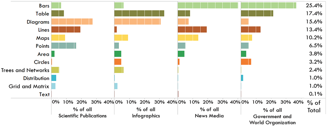
Fig. 2. Breakdown of visualization categories by visualization sources based on 2,070 single, static visualizations.
All of the 5,693 visualizations were manually categorized as single or multiple. Many of the infographics visualizations were categorized as multiple and were excluded from the study. In total we identified 2,070 single visualizations, i.e., stand-alone visualizations with one panel. They were further annotated with the twelve main categories of our taxonomy (Table 1) plus the binary property pictorial to identify images with human-recognizable elements. The annotations were done by ten Harvard University undergraduates who had completed the Harvard introductory visualization course. The students received an introduction to the taxonomy and were monetarily compensated for their work. In the future we plan to further annotate our database with all the graph sub-types and properties of our taxonomy using Amazon’s Mechanical Turk.
5 ANALYSIS OF VISUALIZATION TYPES
Our annotated data enables us to study the distribution of online visualization types across publication venues. Examining the ratio of single to multiple visualization images per source, as shown in Table 2, we see that visualizations categorized as multiple tend to be most numerous in scientific publications and infographic sources. These multipanel visualizations are primarily used when narrative is involved, and having multiple visualizations are necessary for, e.g., explaining a concept or telling a story. These visualizations are usually designed to stand alone, without an associated article or paper, and thus are fully responsible for telling and encompassing the whole story. There is also a very high percentage of multiple visualizations in the scientific publication category. There are two primary explanations for this observation. First, like infographics, multiple individual visualizations are combined in a single figure in order to visually explain scientific concepts or theories to the journal readers. Second, combining visualizations into a single figure (even if possibly not directly related) saves page count and money. In contrast, a very high ratio of single visualizations is seen in government / world organizations. These visualizations are usually published one-at-a-time within government reports, and there are no page limits or space issues as with scientific journals.
Analyzing the single visualizations, we see distinct trends of visualization categories between visualization publication venues as shown in Figure 2. Scientific publications, for example, have a large percentage of diagrams. These diagrams are primarily used to explain concepts from the article, or illustrate the results or theories. Also included are renderings (e.g., 3D molecular diagrams). The scientific articles also use many basic visual encoding techniques, such as line graphs, bar charts, and point plots. Domain-specific uses of certain visual encodings are evident, e.g., grid and matrix plots for biological heat maps, trees and networks for phylogenic trees, etc. Infographics also use a large percentage of diagrams. These diagrams primarily include flow charts and timelines. Also included in infographics is a large percentage of tables. These are commonly simple tables or ranked lists that are elaborately decorated and annotated with illustrations. Unlike the other categories, there is little use of line graphs.
In contrast to the scientific and infographic sources, the news media and government sources publish a more focused range of topics, thus employing similar visualization strategies. Both sources primarily rely on bar charts and other “common” (i.e., learnt in primary school) forms of visual encodings such as line graphs, maps, and tables. The line graphs are most commonly time series, e.g., of financial data. One of the interesting differences between the categories include the greater use of circle plots (e.g., pie charts) in government reports.
Looking at specific visualization categories, tree and network diagrams only appear in scientific and infographic publications. This is probably due to the fact that the other publication venues do not publish data that is best represented as trees or networks. Similarly, grid and matrix plots are primarily used to encode appropriate data in the scientific context. Interestingly, point plots are also primarily used in scientific publications. This may be due to either the fact that the data being visualized are indeed best visualized as point plot representations, or it could be due to domain-specific visualization conventions, e.g., in statistics.
Worth noting is the absence of text visualizations from almost all publication venues. The only examples of text based visualizations were observed in the news media. Their absence may be explained by the fact that their data, i.e., text, is not relevant to the topics published by most sources. Another possible explanation is that text visualizations are not as “main stream” in any of the visualization sources we examined as compared to other visualization types. Also worth noting is that these are observations for single, static visualizations. The distributions in Figure 2 may look very different if they included, or were focused solely on, interactive or multiple visualizations.
The distribution of visualizations in this database represents a snapshot of the distributions of visualization types “in the wild.” With a database of this size and breadth we can now attempt to answer the question of what makes a visualization memorable. Understanding memorability may also shed light on some of the strategies employed by the different publication venues. For example, unlike the readers of scientific journals and government reports who are already interested in the text and are pre-motivated to examine the sources, both infographic and news media outlets need to engage their audiences and capture their attention. Are they possibly employing visual strategies that help with memorability? Or are they employing strategies that they think will make a visualization memorable, but in fact are ineffective? To answer these and other questions we designed a memorability experiment discussed in the following sections.
6 MEMORABILITY EXPERIMENT
We ran our memorability experiment using workers on Amazon’s Mechanical Turk to maintain high external validity (i.e., provide us with a diverse pool of participants for the experiment).
6.1 Hypotheses
Based on the authors’ experience in practicing visualization, our hypotheses entering the experiment were:
H.1 Participants will perform worse (i.e., overall have a harder time remembering visualizations) as compared to natural images/photos.
H.2 A visualization is more memorable if it includes a pictogram or cartoon of a recognizable image.
H.3 A visualization is more memorable if there is more color.
H.4 A visualization is more memorable if it has low visual density.
H.5 A visualization is more memorable if it is more “minimalist” (i.e., “good” data-ink ratio).
H.6 A visualization is more memorable if it includes a “familiar” visualization type (i.e., basic graph type taught in school).
H.7 A visualization is less memorable if it comes from a scientific publication venue.
6.2 Target images
We selected a subset of 410 images (∼20% of the single-panel images in our database, Sec. 4) to be “target” visualizations. The attribute rankings (Sec. 3) for the target visualizations were generated by three visualization researchers. Each researcher independently rated the attributes for each visualization. In cases when all three researchers gave different rankings, the visualization was reviewed and discussed by all three researchers until a consensus was reached. If a majority of two out of three researchers agreed their ranking was applied.
Of the 410 target visualizations, 145 are extreme examples of “minimalist” (i.e., data-ink ratio = “good”), 103 are extreme examples of “chart junk” (i.e., data-ink ratio = “bad”), and the other 162 are inbetween on the spectrum (i.e., data-ink ratio = “medium”). Choosing them this way allows us to measure the effects of chart junk, among other attributes, without introducing bias. The target visualizations were also chosen to match the distribution of original visualization sources as well as the distribution of visualization categories of the total 2,070 single-panel visualization population (Fig. 2). Thus the target population is representative of the observed diversity of real-world visualization types.
6.3 Participants and Experimental Set-up
The methodology closely followed that of Isola et al. [21] for measuring scene memorability. The experiment was set up as a game on Amazon Mechanical Turk, where workers were presented with a sequence of images, and had to press a key if they saw an image for the second time in the sequence. The repeated images were the target images of which we had 410, and the rest of the sequence was composed of “filler” images (i.e., the rest of all the single-panel visualizations in the database). Workers could complete up to 17 “levels” of the game, each comprised of about 120 images (targets and fillers) and taking about 4.8 minutes to complete. There was no change in difficulty across the levels, rather they were a way of partitioning the image stream and giving workers the option of taking a break (up to 5 minutes). Workers were paid $0.40 for each successfully-completed level, bringing their possible hourly wage up to almost $5. Workers could exit the game at any time, and were paid for the total amount of the game completed (including partially-completed levels). Upon completing a level, workers could see their average score (i.e., percent correctly-remembered images) for the level.
Target images were the ones for which we were interested in measuring memorability. The rest of the image sequence was filled with vigilance repeats and other filler images. Vigilance repeats consisted of an image repeated twice, with a spacing of 1-7 images, and were meant to be easy to detect. This was implemented to screen out workers that were not paying enough attention to the task. If a worker false-alarmed on more than 50% of the last 30 non-repeat images, the game would end, and the worker would be flagged. If flagged three times, a worker would be paid for the part of the game completed, and would be blocked from further participation.
Images in the sequence were presented for 1 second, with a 1.4 second gap between consecutive images. These sequences contained a different ordering of images for each worker. Images were presented a maximum of 2 times throughout the whole image sequence, and all the repeat images appeared 91-109 images apart. For our experiment, all images were resized to lie within a maximum dimension of 512×512 pixels (while preserving aspect ratios), so as to fit comfortably into a webpage containing the memorability game.
To begin the game, workers had to complete a practice trial with 30 images. Until a worker’s miss rate on the practice fell below 50% and the false alarm rate fell below 30%, the worker could not continue on to the real game. A worker who failed the practice three times would be paid $0.02 for the practice, and blocked from the game.
On Amazon Mechanical Turk, we posted 276 HITs (“Human Intelligence Tasks”), each of which consisted of our game with 17 possible levels. To accept one of our HITs, a worker had to have an approval rate of over 95% in Amazon’s system as a quality check. Of the workers who accepted our HITs, 261 passed the practice. Workers were able to accept the HIT multiple times and pick up where they left off (until either all 17 levels were completed or the worker failed the quality screening described above). Of the 261 workers, 57% saw more than 90% of the target images. The rest completed fewer of the levels. On average, we have 87 responses (SD: 4.3) per target image. The age range of our workers spanned 16 to 66 years, and the mean age was 33.1 (SD: 10.5). The race distribution was: 41.7% Caucasian, 37.5% South Asian, 4.2% African, 4.2% East Asian, 1.1% Hispanic, and 11.3% other/unreported. We did not collect any other demographic information from our workers.
Because we did not restrict participation in our task based on any worker demographics, we believe that we have sampled fairly from the Mechanical Turk worker population. Other studies have surveyed the Mechanical Turk population, and have determined the education and income of the workers to be quite diverse, reporting that the majority of workers earn roughly U.S. $30k per year, and almost half have earned a bachelor’s degree [34, 28].
6.4 Experimental Design & Analysis
Performance Metrics: Workers saw each target image at most 2 times (less than twice if they prematurely exited the game). We measure an image’s hit rate (HR) as the proportion of times workers responded on the second (repeat) presentation of the image. In signal detection terms: HR = HITSHITS+MISSES. We also measured how many times workers responded on the first presentation of the image. This corresponds to workers thinking they have seen the image before, even though they have not. This false alarm rate (FAR) is calculated:
FAR = FAFA+CR, where FA is the number of false alarms and CR is the number of correct rejections (the absense of a response).
For performing a relative sorting of our data instances we used the d-prime metric (otherwise called the sensitivity index). This is a common metric used in signal detection theory, which takes into account both the signal and noise of a data source, calculated as: d0 = Z(HR)−Z(FAR) (where Z is the inverse cumulative Gaussian distribution). A higher d0 corresponds to a signal being more readily detected. Thus, we can use this as a memorability score for our visualizations. A high score will require the HR to be high and the FAR to be low. This will ensure that visualizations that are easily confused for others (high FAR) will have a lower memorability score.
Data Analysis: Of the 410 target visualizations selected for the memorability experiment, 17 were subsequently filtered out because their aspect ratios were deemed too skewed for the comparison to other visualizations to be fair. Visualizations with aspect ratio greater than 3:1 made the text hard to read, and pictographic elements hard to decipher. An initial analysis showed that these images ended up with high FAR, being confused for one another (losing their distinctiveness to aspect ratio similarities).
A set of analyses was run on the remaining images, whereby memorability score was plotted against various visualization attributes (Sec. 3). The plots were constructed by summarizing across all the visualizations, and also by individually considering visualization sources: government / world organizations, news media, infographics, and scientific publications. This was done to see whether there are differences in how the attributes correlate with memorability across different publication venues. To filter out the effect recognizable elements like people and objects have on memorability, the analyses were repeated by only considering visualizations that did not contain pictorial elements (filtered-out manually).
As d-prime is a normalized metric, corrected t-tests were applied in Sec. 7 to evaluate the statistical significance of the memorability scores of the different attributes, visualization types, and visualization sources.
7 EXPERIMENTAL RESULTS & DISCUSSION
7.1 Memorability comparisons
Our memorability experiment was designed to understand the memorability of visualizations within the context of other memorability studies, and treats the visualizations in our experiment as scenes (i.e., images or photographs). This memorability study design does not evaluate the cognitive impact or engagement of the visualization. Our experiment primarily presents baseline results to compare the memorability of visualizations to the memorability of scenes. In other words, we have measured how visualizations would be remembered if they were images.
We observed a mean HR of 55.36% (SD = 16.51%) and mean FAR of 13.17% (SD = 10.73%). For comparison, scene memorability has a mean HR of 67.5% (SD = 13.6%) with mean FAR of 10.7% (SD = 7.6%) [21], and face memorability has a mean HR of 53.6% (SD = 14.3%) with mean FAR of 14.5%(SD = 9.9%) [2]. This possibly supports our first hypothesis that visualizations are less memorable than natural scenes. This demonstrates that there is memorability consistency with scenes, faces, and also visualizations, thus memorability is a generic principle with possibly similar generic, abstract, features.
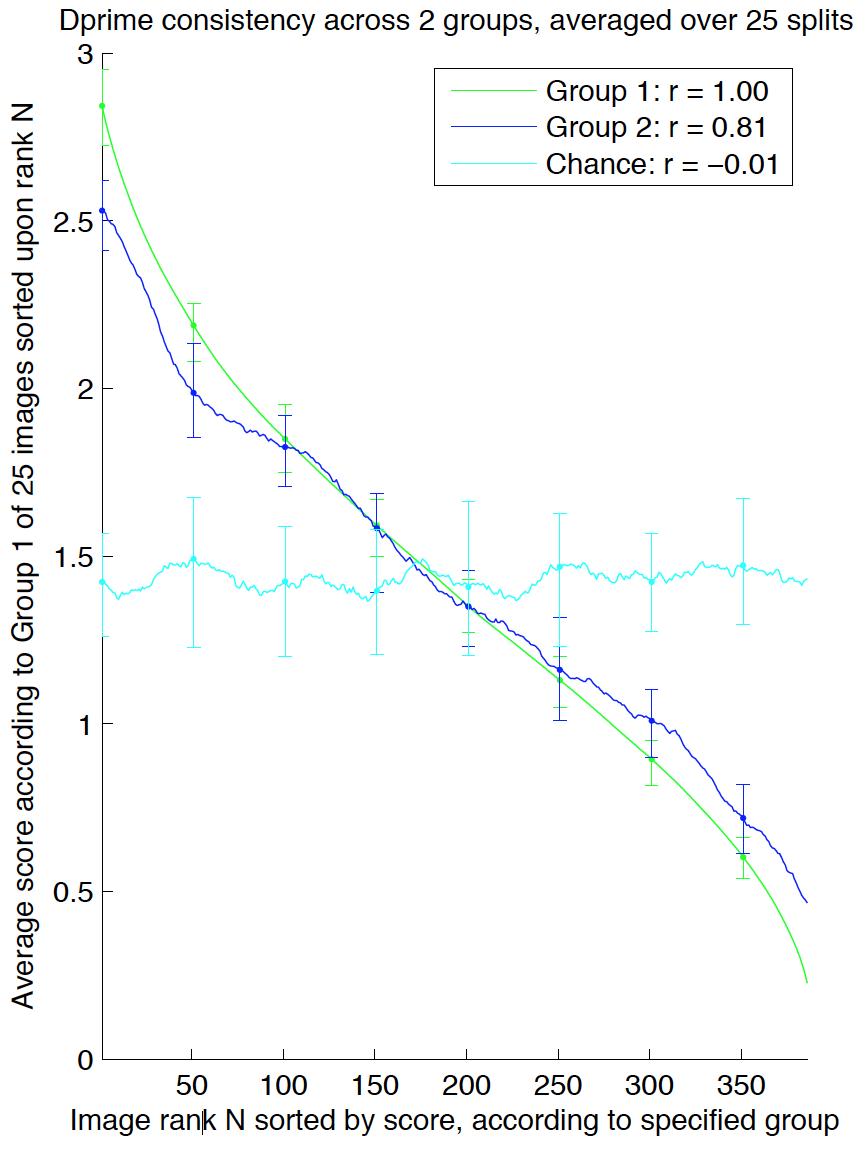
We also measured the consistency of our memorability scores [2, 21]. By splitting the participants into two independent groups, we can measure how well the memorability scores of one group on all the target images compare to the scores of another group (Fig. 3). Averaging over 25 such random half-splits, we obtain Spearman’s rank correlations of 0.83 for HR, 0.78 for FAR, and 0.81 for d-prime, the latter of which is plotted in Fig. 3. This high correlation demonstrates that the memorability of a visualization is a consistent measure across participants, and indicates real differences in memorability between visualizations. In other words, despite the noise introduced by worker variability and by showing different image sequences to different workers, we can nevertheless show that memorability is somehow intrinsic to the visualizations.
Fig. 3. Participants were split into two independent sets, Group 1 and Group 2. Visualizations were ranked by memorability scores (d-prime) from participants in Group 1 (green line) or Group 2 (blue line) and plotted against the average memorability scores given by participants in Group 1. Plots are averaged across 25 such random splits. For clarity, we also convolved the resulting plots with a length-25 box filter along the x-axis. The cyan chance line was simulated by assigning the images random ranks (i.e., randomly permuting the x-axis). Error bars depict 80% confidence intervals. Note that the scores of the two participant halves are highly correlated over the 25 random half-splits.
7.2 Visualization Attributes
Of our 410 target visualizations, 145 contained either photographs, cartoons, or other pictograms of human recognizable objects (from here on out referred to broadly as “pictograms”). Visualizations containing pictograms have on average a higher memorability score (Mean (M)=1.93) than visualizations without pictograms (M = 1.14,t(297)= 13.67,p < 0.001). This supports our second hypothesis. Thus not all chart junk is created equal: annotations and representations containing pictograms are across the board more memorable. However, this is not too surprising as we are evolved to see, segment, and recognize natural objects. Thus an image, or image of a visualization, containing a human recognizable object will be easily recognizable and probably memorable.
Due to this strong main effect of pictograms, we examined our results for both the cases of visualizations with and without pictograms. As shown in the left-most panel of Fig. 1, all but one of the overall top most memorable images (as ranked by their d-prime scores) contain human recognizable pictograms. The one visualization without a human recognizable image, the molecular diagram in the middle of the second row, is the most memorable image of our non-pictogram visualizations (see Fig. 1, middle panel). The least memorable visualizations are presented in the right-most panel of Fig. 1.
Memorability plotted against visualization type
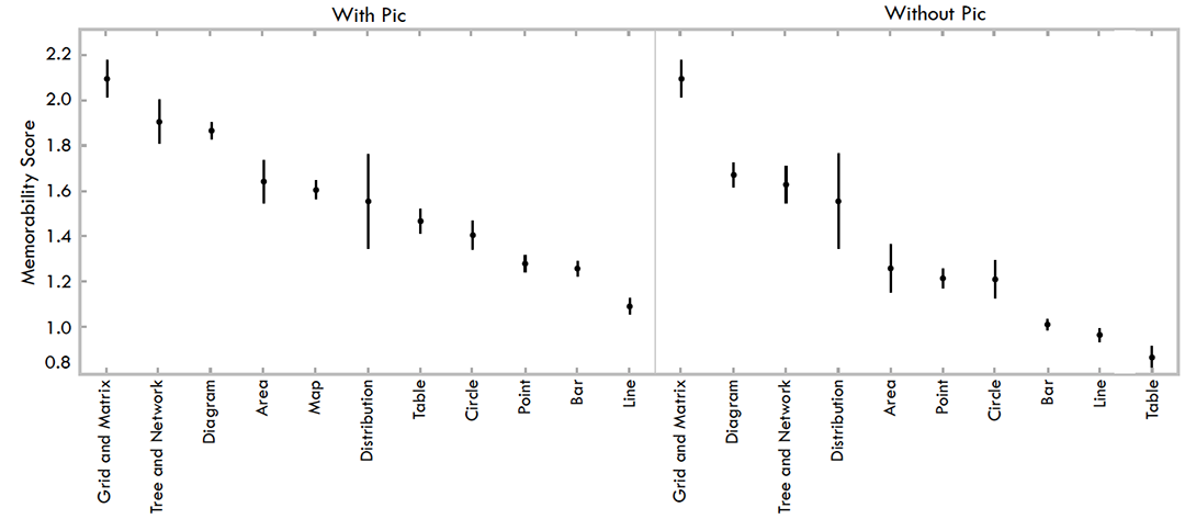 Fig. 7. Memorability scores for visualizations based on visualization type. On the left is all visualizations, and on the right visualizations with pictograms removed.
Memorability plotted against color rating
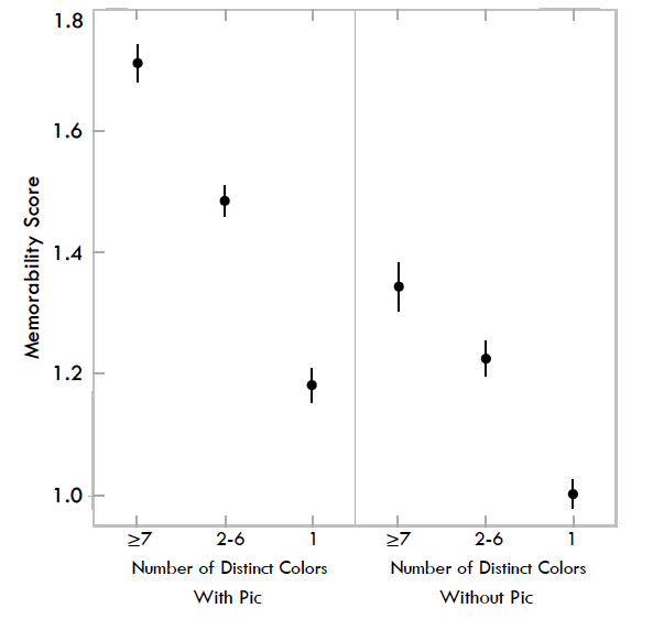
Fig. 4. Memorability scores for visualizations based on the number of colors it contains. On the left is all visualizations, and on the right visualizations with pictograms removed.
Memorability plotted against visual density ranking
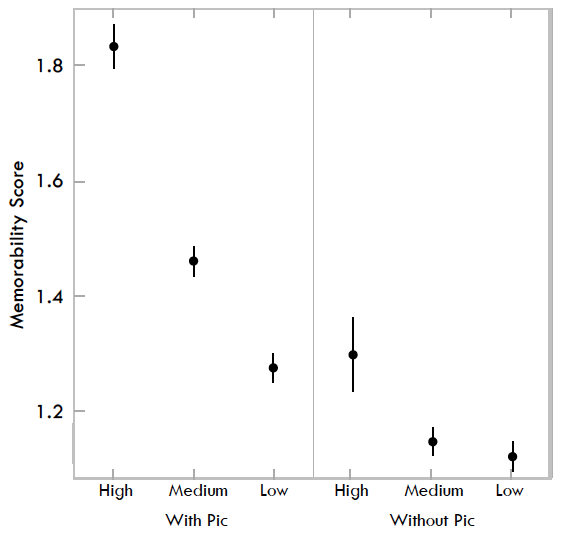
Fig. 5. Memorability scores for visualizations based on visual density. On the left is all visualizations, and on the right visualizations with pictograms removed.
As shown in Fig. 4, there is an observable trend of more colorful visualizations having a higher memorability score: visualizations with 7 or more colors have a higher memorability score (M = 1.71) than visualizations with 2-6 colors (M = 1.48,t(285)= 3.97,p < 0.001), and even more than visualizations with 1 color or black-and-white gradient (M = 1.18,t(220)= 6.38,p< 0.001). When we remove visualizations with pictograms, the difference between visualizations with 7 or more colors (M = 1.34) and those that have only 1 color (M = 1.00) remains statistically significant (t(71)= 3.61,p < 0.001).
Considering all the visualizations together, we observed a statistically significant effect of visual density on memorability scores with a high visual density rating of “3” (M = 1.83), i.e., very dense, being greater than a low visual density rating of “1” (M = 1.28,t(115) = 6.08,p < 0.001) as shown in Fig. 5.
We also observed a statistically significant effect of the data-toink ratio attribute on memorability scores with a “bad” (M = 1.81), i.e., low data-to-ink ratio, being higher than a “good” rating (M = 1.23,t(208)= 6.92,p < 0.001) as shown in Fig. 6. Note that using a corrected t-test, we also arrive at the results that the 3 levels of data-ink ratio are pairwise significantly different from each-other.
Summarizing all of these attribute results: higher memorability scores were correlated with visualizations containing pictograms, more color, low data-to-ink ratios, and high visual densities. This supports our third hypothesis, and refutes our fourth and fifth hypotheses. However, as discussed in Sec. 7.1, we tested the memorability of visualizations as images and not the comprehension of the visualizations. Thus, looking at these visualizations as images and not data encodings, these attributes increased their memorability.
As shown in Fig. 7, diagrams were statistically more memorable than points, bars, lines, and tables. These trends remain observable even when visualizations with pictograms are removed from the data. Other than some minor ranking differences and addition of the map category, the main difference is in the ranking of the table visualization type, which without pictograms becomes least memorable.
The middle panel of Fig. 1 displays the most memorable visualizations that do not contain pictograms. Why are these visualizations more memorable than the ones in the right-most panel? To start with, qualitatively viewing the most memorable visualizations, most are high contrast. These images also all have more color, a trend quantitatively demonstrated in Sec. 7.2 to be correlated with higher memorability. As compared to the more subdued less memorable visualizations, the more memorable visualizations are easier to see and discriminate as images. Another possible explanation is that “unique” types of visualizations, such as diagrams, are more memorable than “common” types of visualizations, such as bar charts. This trend is also evident in Fig. 7 in which grid/matrix, trees and networks, and diagrams have the highest memorability scores. This observation refutes our sixth hypothesis. Examples of these unique types of visualizations are each individual and unique, whereas bar charts and line graphs are uniform with limited variability in their visual encoding methodology. Previously it has been shown that an item is more likely to interfere with another item if it has similar category or subordinate category information, but unique exemplars of objects can be encoded in memory quite well [22]. This supports our findings that show high FAR and low HR for table and bar visualizations, which both have very similar visuals within their category (i.e., all the bar charts look alike). Another contributing factor is that target visualizations represented a distribution of types found “in the wild.” Thus, of the 410 target visualizations, trees and networks totaled 11 targets and grid/matrix totaled 6 targets. Thus their low frequency may have contributed to their uniqueness. However, this was not the case for diagrams, which constituted 57 of the target visualizations.
Memorability plotted against data-ink ratio
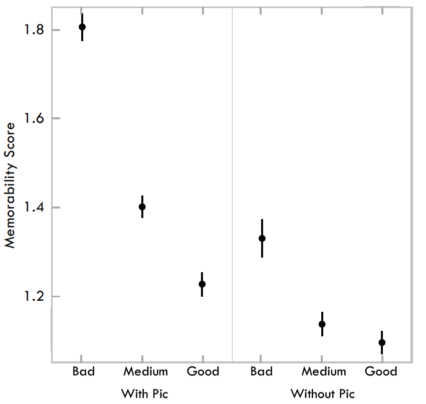
Fig. 6. Memorability scores for visualizations based on the data-to-ink attribute ratings. On the left is all visualizations, and on the right visualizations with pictograms removed.
Another possible explanation is that visualizations like bar and line graphs are just not natural. If image memorability is correlated with the ability to recognize natural, or natural looking, objects then people may see diagrams, radial plots, or heat maps as looking more “natural”. Previous work has shown that people can rapidly identify common objects or concepts, referred to as processing fluency, and that prior expectations will influence a person’s performance [31]. Since we are mostly attuned to natural scenes, it makes sense that some of the top memorable visualizations look closer to “nature” than the others. In these terms, we see that people may have more perceptual fluency with visualizations that at first glance appear to be more “natural” and that this fluency may be influencing memorability.
One common visual aspect of the most memorable visualizations is the prevalence of circles and round edges. Previous work has demonstrated that people’s emotions are more positive toward rounded corners than sharp corners [3]. This could possibly support both the trend of circular features in the memorable images as well as the concept of natural-looking visualizations being more memorable since “natural” things tend to be round.
7.3 Visualization Sources
As shown in Fig. 8, regardless of whether the visualizations did or did not include pictograms, the visualization source with the highest memorability score was the infographic category (M = 1.99,t(147)= 5.96,p < 0.001 when compared to the next highest category, scientific publications with M = 1.48), and the visualization source with the lowest memorability score was the government and world organizations category (M = 0.86,t(220)= 8.46,p < 0.001 when compared to the next lowest category, news media with M = 1.46). These results were significant according to corrected t-tests. Note that these statistically-significant trends hold even with visualizations containing pictograms removed. In fact, with pictograms removed, scientific publications (M = 1.95) become significantly more memorable than news media (M = 1.17,t(23)= 6.92,p < 0.001). The top ten most memorable visualizations from each source category are shown in Fig. 9.
Memorability plotted against visualization source category
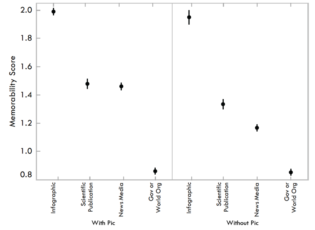
Fig. 8. Memorability scores for visualizations based on original source category. On the left is all visualizations, and on the right visualizations with pictograms removed.
A few things to bear in mind: first of all, as previously stated, this memorability study examined the memorability of visualizations as if they were images and not memorability based on engagement and comprehension of the visualization. Secondly, the visualizations in this category were drawn from Visual.ly with a more design focused venue and audience where the visualizations are intentionally created to be flashy and include stylized elements. Another factor is that visualizations are submitted to Visual.ly and are pre-judged by people before being published. In contrast, the other venues contain a more unbiased and not pre-judged selection of visualizations. The visualizations for a source such as Visual.ly, or even other news media sites, are competing for a viewer’s attention. Thus they will probably be more likely, intentionally or unintentionally, to use bright, bold, pictorial visual elements to grab a reader’s attention. Thus this type of publication venue’s motivational bias may translate into design features that lead to higher memorability.
Another possible influence of visualization source on memorability score is publication venue specific aesthetics. Many visualizations, particularly those from the news media and government sources, tend to publish with the same visual aesthetic style. This may be due to either the venue maintaining a consistent look so viewers will automatically recognize that a visualization was published by them, or because they have editorial standards to create visualizations that appear similar. This may have a negative impact on memorability scores because visualizations of similar aesthetics lack uniqueness. This may be a contributing factor to the observed trend (see Fig. 8) that visualization sources that have non-uniform aesthetics tend to have higher memorability scores than sources with uniform aesthetics. This observation refutes our last hypothesis that visualizations from scientific publications are less memorable. This may also be due to the fact that visualizations in scientific publications have a high percentage of diagrams (Fig. 2), similar to the infographic category.
8 CONCLUSIONS AND FUTURE WORK
The results of our memorability experiment show that visualizations are intrinsically memorable with consistency across people. They are less memorable than natural scenes, but similar to images of faces, which may hint at generic, abstract, features of human memory. Not surprisingly, attributes such as color and the inclusion of a human recognizable object enhance memorability. And similar to previous studies we found that visualizations with low data-to-ink ratios and high visual densities (i.e., more chart junk and “clutter”) were more memorable than minimal, “clean” visualizations. It appears that we are best at remembering “natural” looking visualizations, as they are similar to scenes, objects, and people, and that pictorial and rounded features help memorability.
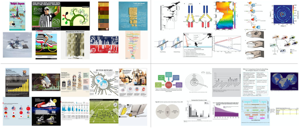 Fig. 9. The top ten most memorable visualizations for each of the four visualization source categories: infographic (top left), scientific publications (top right), news media (bottom left), and government / world organization (bottom right). In each quadrant, the visualizations are ordered most to least memorable from top left to bottom right.
More surprisingly, we found that unique visualization types (pictoral, grid/matrix, trees and networks, and diagrams) had significantly higher memorability scores than common graphs (circles, area, points, bars, and lines). It appears that novel and unexpected visualizations can be better remembered than the visualizations with limited variability that we are exposed to since elementary school. In hindsight this finding is consistent with results for natural scenes and objects.
Our results seem to validate the opinions of proponents on both sides of the chart junk debate. Edward Tufte says: “All the history of information displays and statistical graphics – indeed of any communication device – is entirely a progress of methods for enhancing density, complexity, dimensionality, and even sometimes beauty.” [37] And Nigel Holmes states: “As long as the artist understands that the primary function is to convey statistics and respects that duty, then you can have fun (or be serious) with the image; that is, the form in which these statistics appear.” [18] We believe that visualizations are what Alberto Cairo calls a Functional Art: “something that achieves beauty not through the subjective, freely wandering self-expression of the painter or sculptor, but through the careful and restrained tinkering of the engineer.” [10] But it appears that the artist and designer can have a big influence in making visualizations more memorable.
Understanding what makes a visualization memorable is only the first step to understanding how to create effective data presentations. Making a visualization more memorable means making some part of the visualization “stick” in the viewers mind. We do not want just any part of the visualization to stick (e.g., chart junk), but rather we want the most important relevant aspects of the data or trend the author is trying to convey to stick. If we can accomplish this, then we will have a method for making data more memorable. This will have diverse applications in education, business, and more generally, in how data is presented to wide audiences.
In future work we hope to gain further understanding of the memorability of visualizations. This would include expanding our visualization database in order to gain an even more diverse real world sample, annotating more of the images with all visualization types and attributes of our taxonomy in order to better understand the memorability subtleties of specific types or subtypes of visualizations, annotating visualizations with more fine-grained definitions and measures of visual density, and investigating how memorability is impacted by multiple visualizations (e.g., small multiples or multi-panel visualizations). We plan to investigate the effect of time on memorability of visualizations, and investigate whether certain visual features stick in the viewers mind longer than others. A particular category worth investigating further is pictograms. We would like to break this category down into subtypes to look for specific effects on memorability. We also hope to show in future work that memorability – i.e., treating visualizations as scenes – does not necessarily translate to an understanding of the visualizations themselves. Nor does excessive visual clutter aid comprehension of the actual information in the visualization (and may instead interfere with it). Finally, we hope to conduct eye movement studies to identify the parts of visualizations used for memory or comprehension.
Having a more solid understanding of the memorability of visualizations will also allow us to carefully craft future studies to ask the more important and interesting questions of what makes a visualization comprehensible, engaging, or impactful. With a more solid grasp of what visual elements impact memorability at a low level, we can control for them at a higher level so as not to interfere with other factors in future experiments. We will then be able to start answering the larger questions of how to design effective visualizations.
ACKNOWLEDGMENTS
The authors wish to thank Krzysztof Gajos for his help and guidance in designing and developing the annotation pipeline for the visualization database, and Lars Kellogg-Stedman and the entire Harvard SEAS IT team for their help and technology support for this project. The authors also wish to thank Sean Yeh and Chelsea Yeh for their assistance in helping pilot the online visualization scraping and design of the visualization database. This work was partly supported by the National Science Foundation (NSF) under grant 1016862 to A. Oliva, as well as Google and Xerox. M. Borkin was supported by the Department of Defense through the National Defense Science & Engineering Graduate Fellowship (NDSEG) Program, and P. Isola was supported by a NSF Graduate Research Fellowship.
REFERENCES
- R.C. Anderson and J. W. Pichert. Recall of previously unrecallable information following a shift in perspective. Journal of Verbal Learning and Verbal Behavior, 17(1):1–12, 1978.
- W.A. Bainbridge, P. Isola, and A. Oliva. The intrinsic memorability of face images (in press). Journal of Experimental Psychology: General, 2013.
- M. Bar and M. Neta. Humans prefer curved visual objects. Psychological science, 17(8):645–648, 2006.
- S. Bateman, R. L. Mandryk, C. Gutwin, A. Genest, D. McDine, and C. Brooks. Useful junk?: the effects of visual embellishment on comprehension and memorability of charts. In Proceedings of the 28th International Conference on Human Factors in Computing Systems, CHI ’10, pages 2573–2582. ACM, 2010.
- C. Behrens. Infodesignpatterns. http://www.niceone.org/ infodesignpatterns/index.php5, 2013.
- J. Bertin. Semiology of graphics: diagrams, networks, maps. 1983.
- A.F. Blackwell and T. Green. Does metaphor increase visual language usability? In Visual Languages, 1999. Proceedings. 1999 IEEE Symposium on, pages 246–253. IEEE, 1999.
- R. Borgo, A. Abdul-Rahman, F. Mohamed, P. W. Grant, I. Reppa, L. Floridi, and M. Chen. An empirical study on using visual embellishments in visualization. Visualization and Computer Graphics, IEEE Transactions on, 18(12):2759–2768, 2012.
- T.F. Brady, T. Konkle, G. A. Alvarez, and A. Oliva. Visual long-term memory has a massive storage capacity for object details. Proceedings of the National Academy of Sciences, 105(38):14325–14329, 2008.
- A. Cairo. The Functional Art: An Introduction to Information Graphics and Visualization. New Riders, 2013.
- W. S. Cleveland and R. McGill. Graphical perception: Theory, experimentation, and application to the development of graphical methods. Journal of the American Statistical Association, 79(387):531–554, 1984.
- Y. Englehardt. The language of graphics: A framework for the analysis of syntax and meaning in maps, charts and diagrams. PhD thesis, Institute for Logic, Language and Computation, University of Amsterdam, 2002.
- S. Few. Benefitting infovis with visual difficulties? Provocation without a cause. Visual Business Intelligence Newsletter, 2011.
- S. Few. The chartjunk debate: A close examination of recent findings. Visual Business Intelligence Newsletter, 2011.
- R. L. Harris. Information graphics: A comprehensive illustrated reference. Oxford University Press, 1999.
- J. Heer, M. Bostock, and V. Ogievetsky. A tour through the visualization zoo. Communications of the ACM, 53(6):59–67, 2010.
- J. Heer and B. Shneiderman. Interactive dynamics for visual analysis. Queue, 10(2):30, 2012.
- N. Holmes. Designer’s Guide to Creating Charts and Diagrams. WatsonGuptill Publications, 1984.
- J. Hullman, E. Adar, and P. Shah. Benefitting infovis with visual difficulties. Visualization and Computer Graphics, IEEE Transactions on, 17(12):2213–2222, 2011.
- P. Isola, D. Parikh, A. Torralba, and A. Oliva. Understanding the intrinsic memorability of images. In J. Shawe-Taylor, R. Zemel, P. Bartlett, F. Pereira, and K. Weinberger, editors, Advances in Neural Information Processing Systems (NIPS), volume 24, pages 2429–2437, 2011.
- P. Isola, J. Xiao, A. Torralba, and A. Oliva. What makes an image memorable? In Computer Vision and Pattern Recognition (CVPR), 2011 IEEE Conference on, pages 145–152. IEEE, 2011.
- T. Konkle, T. F. Brady, G. A. Alvarez, and A. Oliva. Conceptual distinctiveness supports detailed visual long-term memory for real-world objects. Journal of experimental psychology. General, 139(3):558–578, 2010.
- T. Konkle, T. F. Brady, G. A. Alvarez, and A. Oliva. Scene memory is more detailed than you think the role of categories in visual long-term memory. Psychological Science, 21(11):1551–1556, 2010.
- S. M. Kosslyn. Understanding charts and graphs. Applied cognitive psychology, 3(3):185–225, 1989.
- E. Lee. Visualizing blog: A taxonomy of data visualization. http://www.visualizing.org, 2013.
- R. Lengler and M. J. Eppler. Towards a periodic table of visualization methods for management. In IASTED Proceedings of the Conference on Graphics and Visualization in Engineering (GVE 2007), Clearwater, Florida, USA, 2007.
- K. Marriott, H. Purchase, M. Wybrow, and C. Goncu. Memorability of visual features in network diagrams. Visualization and Computer Graphics, IEEE Transactions on, 18(12):2477–2485, 2012.
- W. Mason and S. Suri. Conducting behavioral research on Amazon’s Mechanical Turk. Behav Res, 44:1–23, 2012.
- O. Neurath. From hieroglyphics to Isotype: A visual autobiography. Hyphen Press, London, 2010.
- S. Pinker. A theory of graph comprehension. Artificial intelligence and the future of testing, pages 73–126, 1990.
- R. Reber, N. Schwarz, and P. Winkielman. Processing fluency and aesthetic pleasure: is beauty in the perceiver’s processing experience? Personality and social psychology review, 8(4):364–382, 2004.
- J.C. Roberts. Display models-ways to classify visual representations. International Journal of Computer Integrated Design and Construction, 2(4):241–250, 2000.
- J.F. Rodrigues, A. J. Traina, M. C. F. de Oliveira, and C. Traina. Reviewing data visualization: an analytical taxonomical study. In Information Visualization, 2006. IV 2006. Tenth International Conference on, pages 713–720. IEEE, 2006.
- J. Ross, L. Irani, M. S. Silberman, A. Zaldivar, and B. Tomlinson. Who are the Crowdworkers? Shifting Demographics in Mechanical Turk. CHI EA, pages 2863–2872, 2010.
- B. Shneiderman. The eyes have it: A task by data type taxonomy for information visualizations. In Visual Languages, 1996. Proceedings., IEEE Symposium on, pages 336–343. IEEE, 1996.
- M. Tory and T. Moller. Rethinking visualization: A high-level taxonomy. In Information Visualization, 2004. INFOVIS 2004. IEEE Symposium on, pages 151–158. IEEE, 2004.
- E. Tufte. Envisioning Information. Cheshire (Conn.), 1990.
- E. Tufte. The Visual Display of Quantitative Information. Cheshire (Conn.), 2001.
- A. Vande Moere, M. Tomitsch, C. Wimmer, B. Christoph, and T. Grechenig. Evaluating the effect of style in information visualization. Visualization and Computer Graphics, IEEE Transactions on, 18(12):2739–2748, 2012.
Related Posts